Contrasting Tape for Low-Vision Weights
Understanding Low-Vision Needs and the Power of Contrast
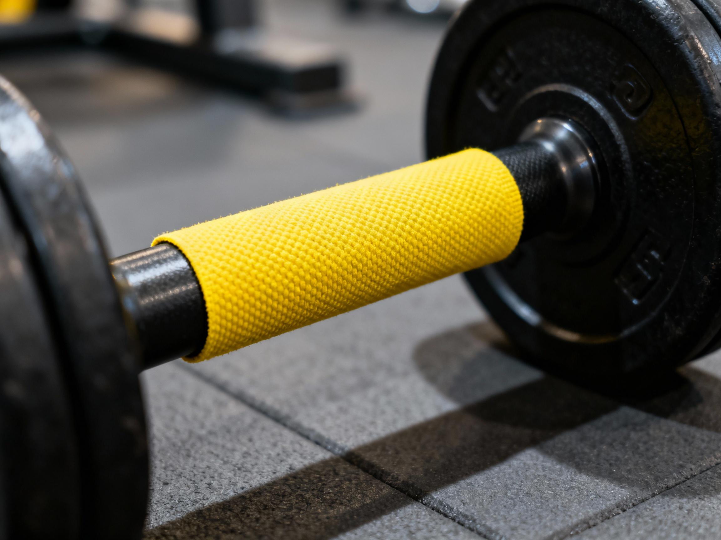
For individuals with low vision, navigating daily tasks often hinges on the ability to distinguish objects through color and contrast. Weightlifting equipment, though designed for functionality, frequently lacks accessibility considerations. Standard dumbbells, barbells, or kettlebells may blend into gym floors or racks, posing safety risks and creating frustration. Contrasting tape addresses this by introducing high-visibility markings that highlight edges, grips, or weight increments. The principle is simple: by amplifying visual boundaries, users can interact with equipment confidently.
The Science Behind Contrasting Tape Design
Effective contrasting tape relies on color theory and luminance contrast. Research shows that combinations like black-and-yellow or white-and-navy achieve maximum visibility for low-vision users. The tape’s material also matters: non-slip textures prevent slippage during workouts, while durable adhesives withstand sweat and friction. Studies indicate a minimum 70% luminance contrast ratio is optimal for readability, a metric manufacturers prioritize. Additionally, retroreflective tapes can enhance visibility under low-light conditions, catering to diverse environments.
Practical Applications in Fitness and Beyond
Beyond gym equipment, contrasting tape has versatile uses. It can mark stair edges, appliance controls, or mobility aids like canes. In fitness settings, applying tape to weight plates’ rims or resistance bands’ endpoints helps users quickly identify increments. Therapists often recommend combining tape with tactile markers—such as raised dots—for multi-sensory cues. Case studies reveal gyms that adopted these modifications saw increased participation from low-vision clients, fostering inclusivity.
User-Centric Design: Balancing Aesthetics and Function
While functionality is paramount, aesthetics play a role in adoption. Contrasting tape need not clash with surroundings; modern designs incorporate patterns or muted tones that blend with equipment while maintaining visibility. For example, metallic silver tape on stainless steel racks provides subtle contrast. User feedback emphasizes the importance of customizable options—athletes may prefer bold colors for quick identification, while home users might opt for minimalist designs.
Overcoming Challenges in Implementation
Adopting contrasting tape isn’t without hurdles. Poor adhesion on textured surfaces or uneven edges can reduce effectiveness. Experts suggest cleaning equipment with alcohol wipes before application and using alignment tools for precision. Cost is another factor: while commercial-grade tapes are pricier, DIY alternatives like waterproof vinyl strips offer affordable solutions. Training staff to apply tape correctly—and educate users on its purpose—is critical for long-term success.
Future Innovations in Accessibility Tools
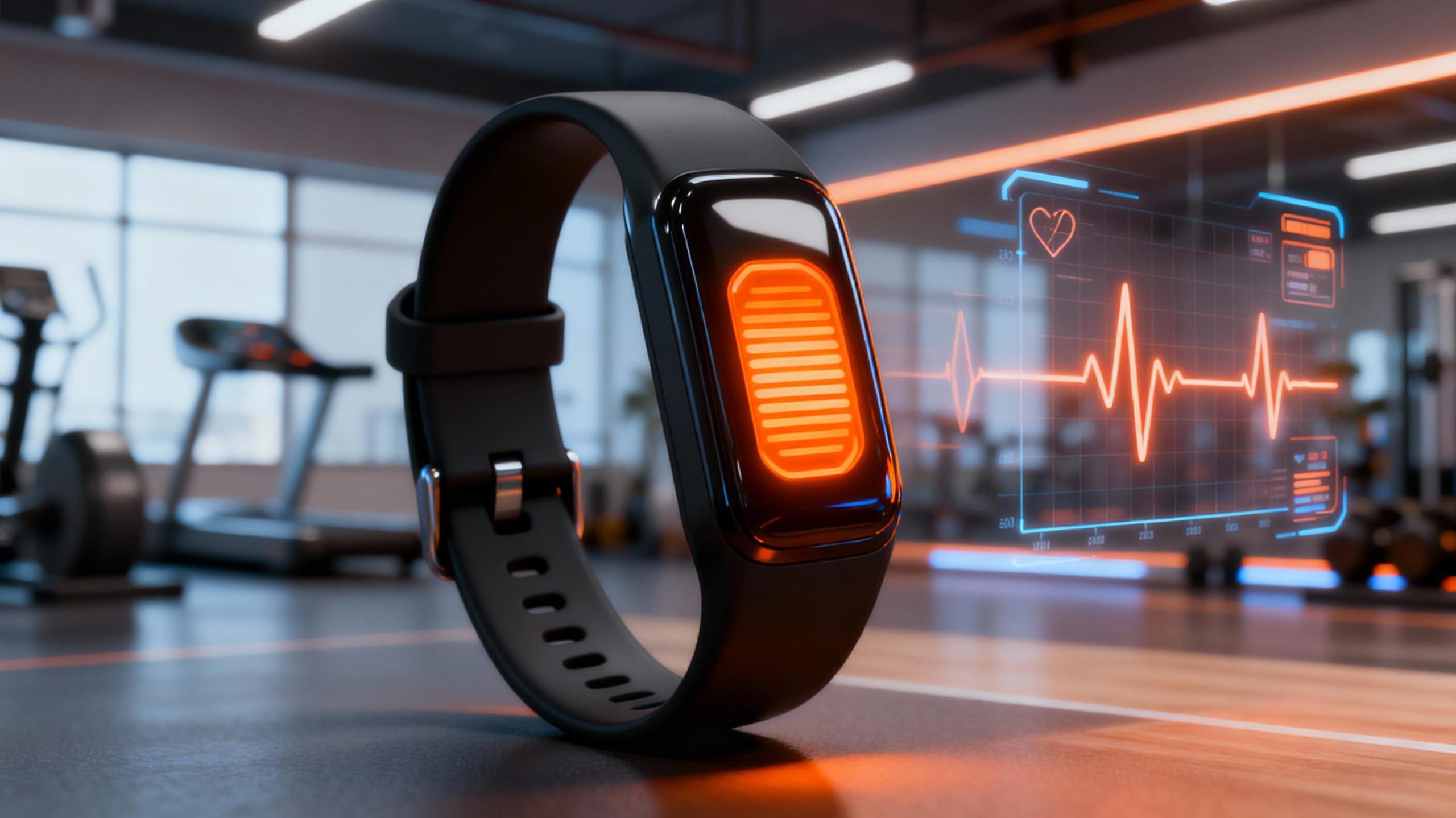
Emerging technologies are expanding accessibility. Smart tapes with embedded sensors could audibly announce weight levels via Bluetooth. Thermochromic tapes that change color with grip pressure might provide real-time feedback. Collaborations between designers, engineers, and low-vision communities are driving these advances. The goal is universal design—products that serve everyone without retrofitting.
